- Introduction
- Types of forms
- Properties of the Forms
- Data Cards
- Types of Data Cards
Form control in power apps is used to Display, Edit and Create a Record in your data source.
The primary purpose of a form is to give and receive data to a source. The real benefit of forms is the ability to choose the exact fields you wish to view or edit and have all of the appropriate labels and input controls generated for you with little effort. The form mode tells the form how to communicate with the data source, Like you wish to view a record, edit and existing record, or create a whole new one.
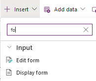
Types of Forms :-
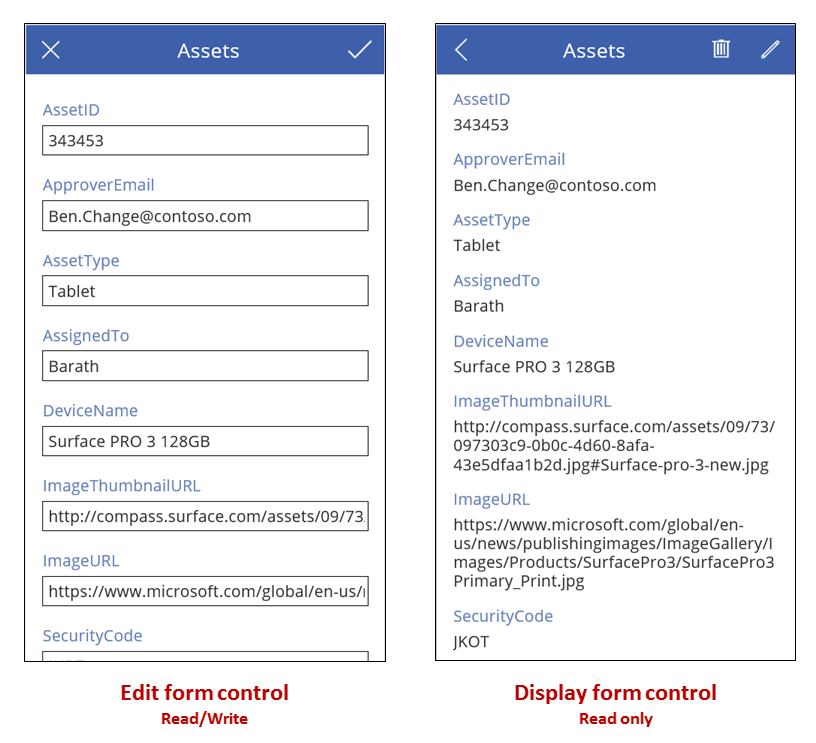
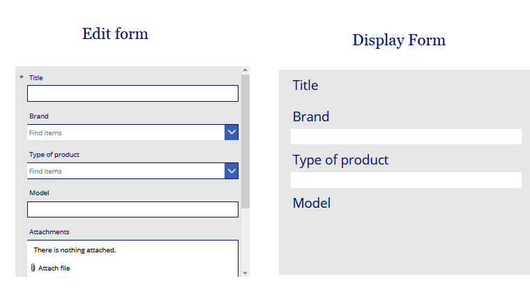
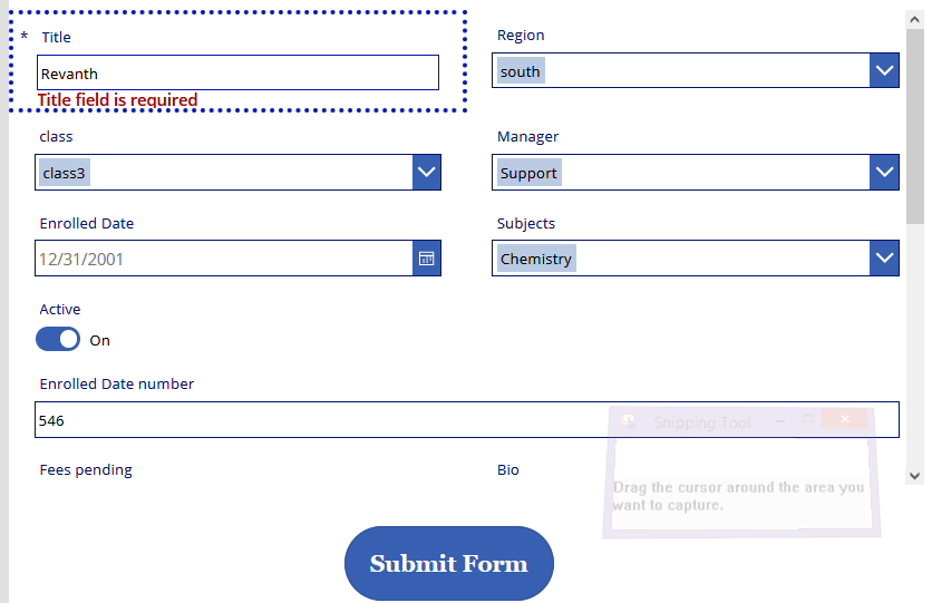
Edit Form :- an Edit form(Read/Write) control can be used to Add, edit and view a Record (item) from your Data source.It Allows you to edit existing data and add new data to your data source , The edit form also be used to display data from your data source.
The edit form can do exactly what the display form does & More because we can change the Behavior of the Mode of this form to act like a new form/edit form which basically allows us to reuse the form control for different scenarios.
Display Form :- With Display form (Read)control, the user can display all fields of a record or only the fields that you specify. It only Display the fields from a data source in read only form it can only display a single record from our data source.
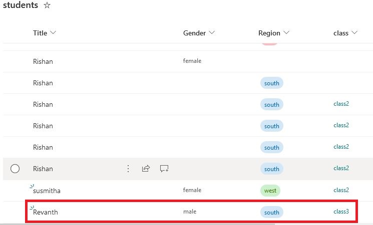
Here i have displayed The items in the SharePoint List “Electronics” as a Data source
Properties of the forms :-
The key properties of the form control includes
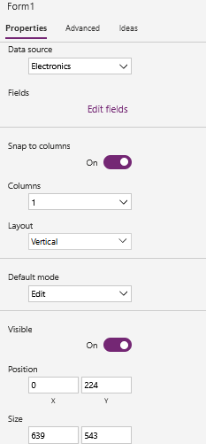
Data Source : Here i am connecting a SharePoint List “Electronics” . When you select the data source it will bring the columns from my data source . These columns are listed here in the form of the fields.
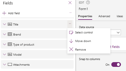
Edit Fields : It will display the list of the fields that are being displayed in this control form.
If you need to make changes on a particular field we need to go to the three ellipses o a particular field
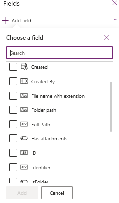
we can also add the fields by using “+ Add field” : this will list out all the fields which are not part of our form currently and make a selection and add it to the your form control
we can also have the ability to reorder or reposition the fields on this form control for that we need to just drag and drop the fields in your desired position so that the order of the field will be re-changed or we can reorder fields by selecting them directly on the form control and reposition them.
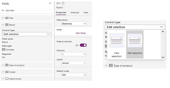
Control Type : we can edit each control type by going to the a particular field and selecting it , not only control type but also we can edit field name , Data type and Required option.
Snap to Columns : By default it is turned on , It automatically places the data cards Depending upon the column number that you have specified in the columns Drop down.
To customize the size of the fields it’s better to switch off the snap to columns.
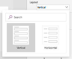
Layouts :
We can set the layouts in two ways
- Vertical
- Horizontal
Default Mode : The default mode will be used to set the form control in three modes
- Edit Mode : will be used to edit the existing record
- View Mode :will be used to view the data in the fields
- New Mode : will be used to create a new record
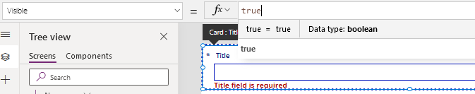
Visible :
It will be used when we need to set the form in either visible mode or un-visible mode
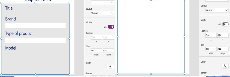
We can set the position in X and y Properties & Size by adjusting width and Height Properties as well.
Color : color property will be used to fill the form control with different colors
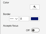
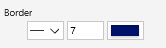
Border : Border can be set by adjusting the layout of the border line and width of the border and color of the border line.
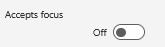
Accepts Focus :
This is used whether to set the field can receive keyboard focus.
Data Card :- Each field in the Form control is a data card.
card controls are the building blocks of the Edit Form and Display Form controls in canvas apps. The form represents the entire record, and each card represents a single field of that record.
Types of Data cards :- Each Data card contains 4 Key controls
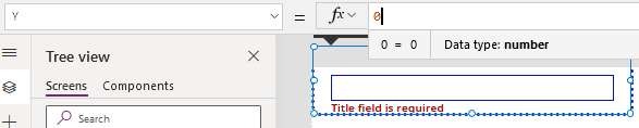
- StarVisible : This label control shows the star symbol if this field is required column
- ErrorMessage : will show the error massages related to the any validation errors that could potentially comes.
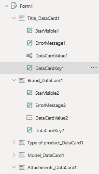
3. DataCardKey : This contains the Name of the column / field from your Data Source
4. DataCardValue : The type of this control will depends upon the type of the column field in your Data Source. That types include single line of text column, choice column and drop downs etc.
Properties of Data Cards :
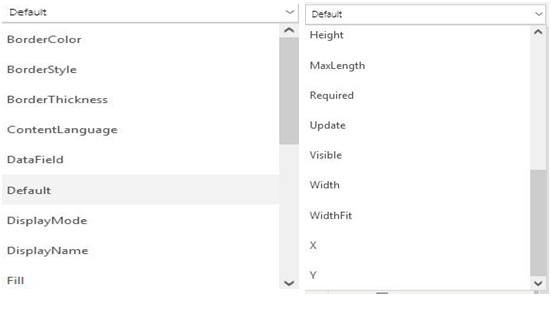
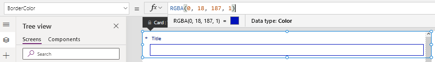
Border color : we can set the Border color of the data card
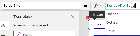
Border style : styles are of different in the view where we can set the styles like solid, Dotted and Dashed.
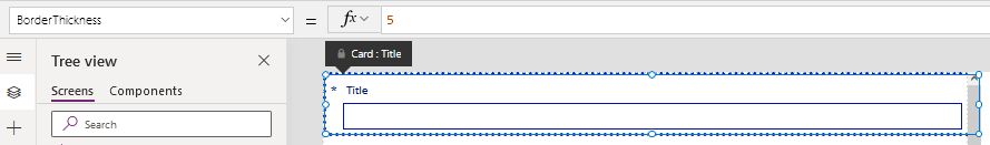
Border Thickness : The Thickness of the Boarder can be changed here by setting a different number
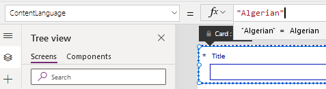
Content Language : The language of the content will be changed here.
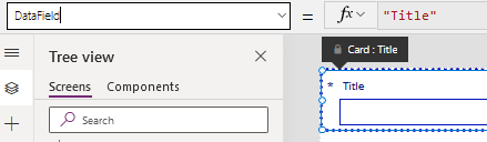
Data Field : The field will be indicated here.
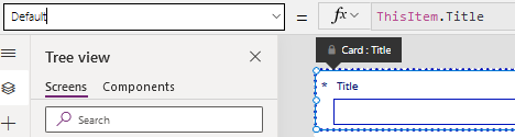
Default : The Default property of the field will be shown here.
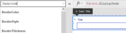
Display Mode : The Mode of your Data card will be set here like Display mode, Edit mode, New mode.
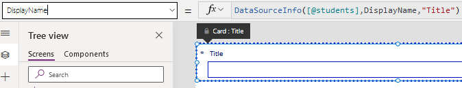
Display Name : It will show the Data source information and the field name.
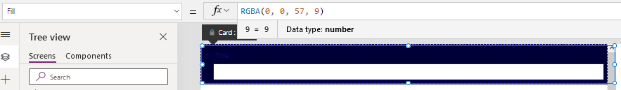
Fill : It will indicate the color to be filled for a particular field.
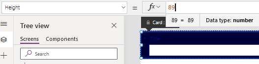
Height : we can adjust the height of the Data card.
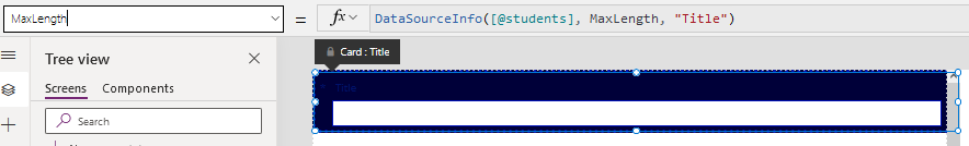
Max length : it will indicate the maximum number of Allowed characters.
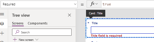
Required : The required field will be indicated by using a symbol. When you leave it without giving a text it will pass an error massage.
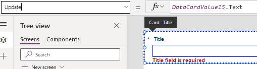
Update : It will give an update of our Data card.
Visible : we can set the data card in visible mode or un-visible mode by setting it in true or false mode.
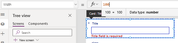
Width : we can increase or decrease the width of the data card.
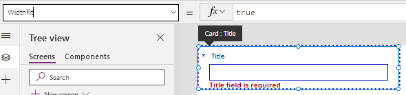
Width Fit : When we set it to true, the size of the data card will be resized according to the form size.
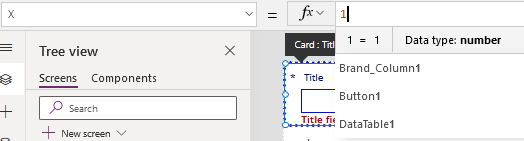
X : it can indicate the X axis
Y : it can indicate the Y axis
SubmitForm :- Will be used to submit the data to our Data source.
Insert a Button control and add a function to the Button control in the onselect property.
| SubmitForm(Form2) |
Run the app and add the details in the form.
Check the SharePoint list the items are added to the list.