A timer control can define how your App responds after a certain amount of time has passed. Timers can determine how long a control appears or change other properties of a control after certain amount of time passed.
In power app studio, Timer runs only in Preview Mode.
The timer duration tells how long the Power Apps timer will run in milliseconds.
By Default, the Power Apps timer duration is 60 seconds.
And the Max timer Duration is 24 hours expressed in milliseconds.
How to add the Power Apps Timer Control?
- Login to your Power App Studio with your credentials.
- Create canvas App from blank.
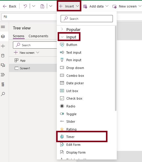
- Then add the Power Apps Timer Control, Go to Insert tab > Click on Input > Select Timer as shown below.
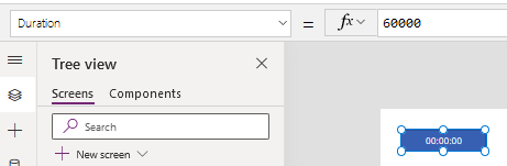
After adding the Timer control to your Power Apps Canvas app it will appear as shown below, with a default duration of 60000 milliseconds that represent 60 seconds, and you can increase it up to 24 hours.
By default if you run your Timer canvas app now and click on the timer it will start to count up to the the Timer duration that you present in the duration property of the timer control, also if you press again the timer button,it will stop, and so on within every click on the timer it will change its status from start to stop and from stop to start.
Properties of Timer control :-
Duration Defines How long a timer runs in milliseconds. Default it is 60 seconds. The maximum is 24 hours expressed in milliseconds.
OnTimerStart Defines Actions to perform when a timer starts to run.
OnTimerEnd Actions to perform when a timer finishes running.
Repeat Whether a timer automatically restarts when it finishes running.
Align The location of text in relation to the horizontal center of its control.
AutoPause Whether the timer control automatically pauses if the user navigates to a different screen.
AutoStart Whether the timer control automatically starts to play when the user navigates to the screen that contains that control.
Bordercolor The color of a control’s border.
Borderstyle Whether a control’s border is Solid, Dashed, Dotted, or None.
BorderThicness The thickness of a control’s border.
Color The color of text in a control.
DisplayMode Whether the control allows user input (Edit), only displays data (View), or is disabled (Disabled).
DisabledBorderColor The color of a control’s border if the control’s DisplayMode property is set to Disabled.
DisabledColor The color of text in a control if its DisplayMode property is set to Disabled.
DisabledFill The background color of a control if its DisplayMode property is set to Disabled.
Fill The background color of a control.
FocusedBordercolor The color of a control’s border when the control is focused.
FocusedBorderThickness The thickness of a control’s border when the control is focused.
Font The name of the family of fonts in which text appears.
FontWeight The weight of the text in a control: Bold, Semibold, Normal, or Lighter.
Height The distance between a control’s top and bottom edges.
HoverBorderColor The color of a control’s border when the user keeps the mouse pointer on that control.
HoverColor The color of the text in a control when the user keeps the mouse pointer on it.
HoverFill The background color of a control when the user keeps the mouse pointer on it.
Italic Whether the text in a control is italic.
Onselect Actions to perform when the user taps or clicks a control.
PressedBorderColor The color of a control’s border when the user taps or clicks that control.
Pressedcolor The color of text in a control when the user taps or clicks that control.
Pressed Fill The background color of a control when the user taps or clicks that control.
Reset Whether a control reverts to its default value.
Size The font size of the text that appears on a control.
Start Whether the timer starts.
Strikethrough Whether a line appears through the text that appears on a control.
TabIndex Keyboard navigation order in relation to other controls.
Text Text that appears on a control or that the user types into a control.
Tooltip Explanatory text that appears when the user hovers over a control.
Underline Whether a line appears under the text that appears on a control.
Visible Whether a control appears or is hidden.
Width The distance between a control’s left and right edges.
X The distance between the left edge of a control and the left edge of its parent container (screen if no parent container).
Y The distance between the top edge of a control and the top edge of the parent container (screen if no parent container).
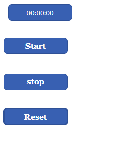
PowerApps start timer on button click
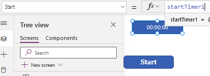
Insert a Button and rename it as “Start” . The Main purpose of the button is to pass a start action to the timer so that the timer will start and runs .
Indicate a variable(startTimer1) in the Onselect property of the Button. if you will set the variable in the same screen, then you can use the context variable, but if you want to use the variable in another screen you can use the global variables . Here i am using A local variable.
Write a formula in the Onselect property of the Button
| UpdateContext({startTimer1:false});UpdateContext({startTimer1:true}); |
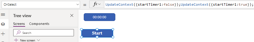
you have to set the variable “StartTimer1” to be false first to work correctly when the last value of the variable is true to avoid the timer not starting status.
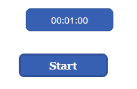
Now set the Start property of the Timer control to “startTimer1”.In the Start property of the timer control type the context variable name as shown below
Preview the app and tap the “start” button so that the Timer will start and ends after 60 seconds.
In some cases, when you will start the timer for the first time, it won’t work, that is why we should stop the timer first, and we solved this issue by passing the false value to the variable to set the timer to the stop status first, then pass the true value to start the variable, so it will work correctly.
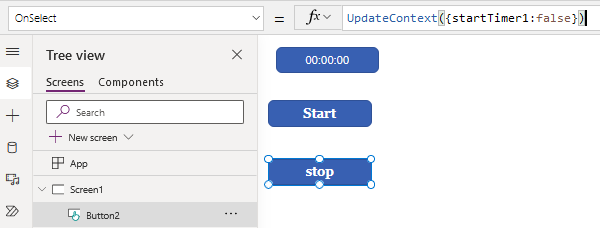
PowerApps stop timer on button click
Insert a Button and rename it as “Stop” . The Main purpose of the button is to pass a stop action to the timer so that the timer will stop running .
Indicate a variable(startTimer1) in the Onselect property of the Button.
Write a formula in the Onselect property of the Button
UpdateContext({startTimer1:false}) |
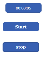
Now preview the app and tap on the stop button the timer will start running.
PowerApps Reset timer control to zero
In the OnSelect property of the Reset button write the bellow formula to pass the Timer control to the Reset function
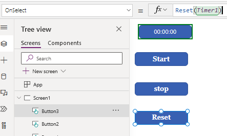
When you click on the reset button on the preview of the button the timer will be set to reset again from 0 sec.
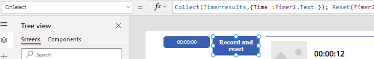
Record the Timer :
create a collection to store the records of the timer control and add that collection to the gallery to display
| Collect(Timerresults,{Time : Timer1.Text }); Reset(Timer1 |
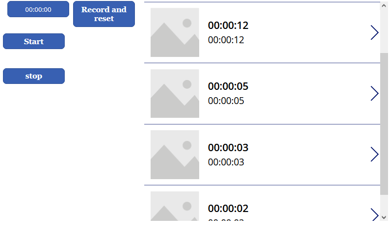
Add a Gallery to the app and connect the collection to the gallery.
When you preview the app the recordings will be shown in the gallery control as shown below.
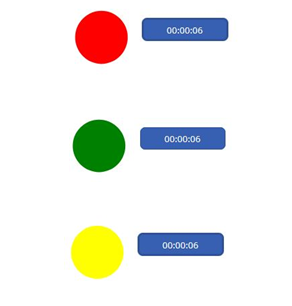
Signal colors Display Using Timer Control :-
Insert a Timer control and change the properties of the Timer as below:
set the AutoStart property to true for the Timer control to srart the Timer Automatically.
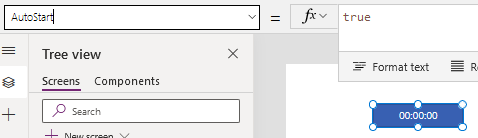
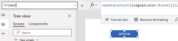
write the following formula in the onselect property of the Timer control where i have initialized a variable “signalcolor” and set it in blank state.
| UpdateContext({signalcolor:Blank()}); |
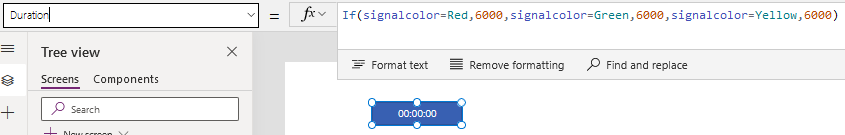
write the following formula in the Duration property of the Timer to display the signal colors for 6 sec each
| If(signalcolor=Red,6000,signalcolor=Green,6000,signalcolor=Yellow,6000) |
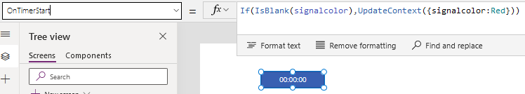
Add the following function in the OnTimerStart property of the Timer control to start the signalcolor with Red color.
| If(IsBlank(signalcolor),UpdateContext({signalcolor:Red})) |
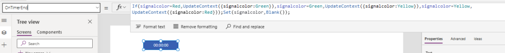
write the following formula in the OnTimerEnds property of the Timer
| If(signalcolor=Red,UpdateContext({signalcolor:Green}),signalcolor=Green,UpdateContext({signalcolor:Yellow}),signalcolor=Yellow,UpdateContext({signalcolor:Red})); |
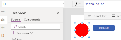
Now add a Circle shape to the screen to display the signal colors
set the Fill property of the Circle to “Signalcolor” variable
Now preview the app we can observe that the signal colors are changing for every 6 sec