
Requirement :
The App or Form can be used in Tablet, Smartphones and other devices. Device Screen size can vary, Hence the Responsive Design should be used to create the app.
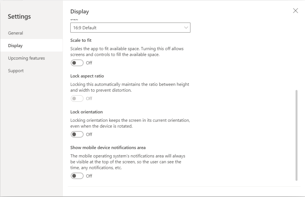
Create a blank canvas app, Go to the Settings in that select the Display and turn off the Scale to fit, Lock Aspect Ratio and Lock Orientation. Once you have done with the Settings in place then Close this.
The Screen’s Size property is calculated by comparing the screen’s Width property to the values in the app’s SizeBreakPoints property. This property is a single column table of number’s that indicate the width BreakPoints that separates the possible values of the Screen’s size property. Canvas app created for tablet or the web. The SizeBreakPoints property of the app has the following default values : [300,600,900,1200]. Canvas app designed for a phone utilizes Co-ordinates that are essentially double the original Co-ordinates.
A container can be an Auto-Layout Container in Horizontal or Vertical direction or a Fixed Layout Container.
Select Header, Main Section and Footer responsive layout ,gives the container the ability to build its own responsive design and settings to control , How it is positioned or re-sized on different sizes of the Screens.
Change the following properties on
App:
           SizeBreakpoints=[300,600,900,1200].
           MinScreenwidth=300.
           MinScreenHeight:320.
Create a new Edit form use SharePoint as Data Source.
A container is a auto-layout container in Horizontal or Vertical direction or a Fixed layout container.
Make the container responsive Change the below mentioned properties :
For ScreenContainer:
                    LayoutWrap:True.
                    Width:Candidateinfo_Screen.Width.
                    Height:Parent.Height.
                    LayoutGap:0.
For HeaderContainer1:
Height:50.
LayoutGap:0.
LayoutMinHeight:100.
LayoutMinWidth:250
Width:Candidateinfo_Screen.Width.
For lblheader:
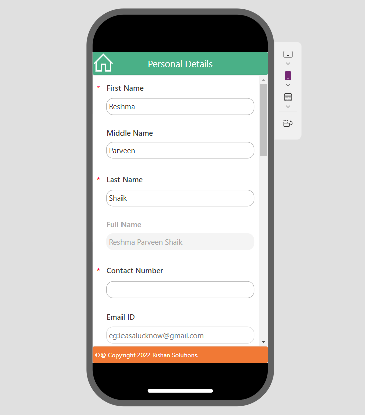
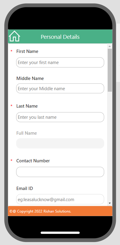
Text:"Personal Details"
Width:Parent.Width.
LayoutMinHeight:40.
LayoutMinWidth:150.
Width:Parent.Width.
For MainSectionContainer1:
Height:200.
LayoutMinHeight:100.
LayoutMinWidth:250.
Width:If(App.MinScreenWidth>600,App.Width/3,App.Width).
Make Form responsive :
For Personaldetailsform:
DataSource:'Candidate Information'
Height:Parent.Height.
LayoutMinHeight:150.
LayoutMinWidth:If(Candidateinfo_Screen.Size=ScreenSize.Small,App.Width/3,App.Width).
Width:Parent.Width.
For FooterContainer1:
Height:35.
LayoutGap:0.
LayoutMinHeight:100.
LayoutMinWidth:250.
Width:Candidateinfo_Screen.Width.
For lblfooter:
lalfooter:Text:"©@ Copyright 2022 Rishan. Solutions."
Width:Parent.Width.
Height:Parent.height.
LayoutMinHeight:40.
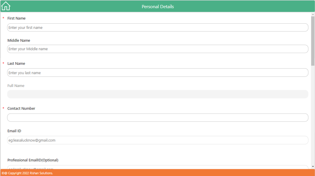
LayoutMinWidth:150.Preview the app, To change the app Canvas view to Tablet view.
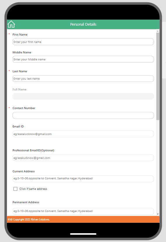
Preview the app, To change the app Canvas view to Phone view.
Responsive power apps with Layout container. User can able to use the application in phone, tablet and browser format. According to the formats, controls inside the container position will be fixed by their own.